David Clinton
What Drives Canada’s Immigration Policies?
News release from The Audit

Government decisions have consequences. But they also have reasons.
Dearest readers: I would love to hear what you think about this topic. So please take the very brief survey at the end of the post.
Popular opposition to indiscriminate immigration has been significant and growing in many Western countries. Few in Canada deny our need for more skilled workers, and I think most of us are happy we’re providing a sanctuary for refugees escaping verifiable violence and oppression. We’re also likely united in our support for decent, hard working economic immigrants looking for better lives. But a half million new Canadians a year is widely seen as irresponsible.
So why did Canada, along with so many other Western governments, choose to ignore their own electorates and instead double down on ever-increasing immigration rates? Whatever nasty insults we might be tempted to hurl at elected officials and the civil servants who (sometimes) do their bidding, I try to remember that many of them are smart people honestly struggling to be effective. Governing isn’t easy. So it’s worth cutting through the rhetoric and trying to understand their policies on their own terms.
The Audit is a reader-supported publication. To receive new posts and support my work, consider becoming a free or paid subscriber.
As recently as 2022, the government – as part of its Annual Report to Parliament on Immigration – claimed that:
“Immigration is critical to Canada’s economic growth, and is key to supporting economic recovery”
There you have it. It’s at least officially about the economy. To be fair, the report also argued that immigration was necessary to address labor shortages, support an aging domestic population, and keep up with our “international commitments”. But economic considerations carried a lot of weight.
Now what I’d love to know is whether the “immigration-equals-better-
One possible way to measure economic health is by watching per capita gross domestic product (GDP) growth rates. Insofar as they represent anything real, the inflation-adjusted GDP rates themselves are interesting enough. But it’s the rates by which GDP grows or contracts that should really capture our attention.
The green line in the graph below represents Canada’s (first quarter) GDP growth rates from the past forty years. To be clear, when measured against, say, its 1984 value, the GDP itself has trended upwards fairly consistently. But looking at changes from one year to the next makes it easier to visualize more detailed historical fluctuations.
The blue bars in the chart represent each year’s immigration numbers as a percentage of the total Canadian population. That rate leapt above one percent of the population in 2021 – for the first time since the 1960’s – and hasn’t shown any signs of backing down. Put differently, Canada absorbed nearly 12 immigrants in 2023 for every 1,000 existing residents.
 |
Seeing both trends together in a single chart allows us to spot possible relationships. In particular, it seems that higher immigration rates (like the ones in 2018-2019 and 2022-2023) haven’t consistently sparked increases in the GDP.
With the exception of those COVID-crazed 2020 numbers – which are nutty outliers and are generally impossible to reliably incorporate into any narrative – there doesn’t ever seem to have been a correlation between higher immigration rates and significant GDP growth.
So, at best, there’s no indication that the fragile economy has benefited from that past decade’s immigration surge. As well-intentioned as it might have been, the experiment hasn’t been a success by any measure.
But it has come with some heavy social costs. The next chart shows the painful disconnect between an artificially rising population and a weak housing construction market. The blue bars, as before, represent immigration rates as a percentage of total population. This time, however, they go back all the way to 1961. The red line tells us about the number of single-detached housing starts per 1,000 people.
 |
With the exceptions of the mid-1960’s and the past few years, each of the historical immigration surges visible in the graph was either preceded or accompanied by appropriate home construction rates.
As an anomaly, the 1960’s surge was for obvious reasons far less damaging. Back then you could still purchase a nice three-bedroom house in what’s now considered midtown Toronto for no more than two years’ worth of an average salary. I know that, because that’s exactly when, where, and for how much my parents bought the house in which I spent most of my errant youth. Those elevated immigration levels didn’t lead us into economic crisis.
But what we’re witnessing right now is different. The housing supply necessary to affordably keep us all sheltered simply doesn’t exist. And, as I’ve already written, there’s no reason to imagine that that’ll change anytime over the next decade. (Can you spell “capital gains tax inclusion rate change”? I knew you could.)
Just to be complete, the disconnect doesn’t apply only to detached “built-to-own” houses. This next chart demonstrates that housing starts of all flavours – including rental units – grew appropriately in the context of historical immigration surges, but have clearly been dropping over the last couple of years.
 |
Since housing starts data isn’t the only tool for measuring the health of a housing market, here’s a visualization of rental apartment vacancy rates in Canada:
 |
The combination of a sluggish construction market and an immigration-fueled population explosion has been driving up prices and making life miserable for countless families. And things appear to be headed in the wrong direction.
So sure, immigration should play an important role in Canadian life. But by this point in the game, it’s pretty clear that recent government policy choices failed to reverse economic weakness and contributed to disastrous outcomes. Perhaps it’s time to change course.
Now it’s your turn. I hope you’ll take this very brief (and anonymous) survey.
Share your thoughts. Click to take the Immigration Policy survey.
Assuming we get enough responses, I’ll share the results later.
For the full experience, please subscribe to The Audit.
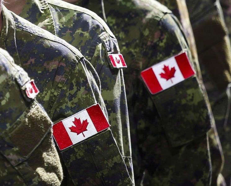

To my great surprise I recently noticed that, despite being deeply engaged in wars against at least four determined enemies, Israel doesn’t spend all that much more on their military than Canada does on its forces. What might that tell us about government efficiency?
There’s fairly universal agreement that Canada doesn’t spend enough on its military. But before we can even ask how much we should be spending, we should understand how much we’re already spending. And figuring that out isn’t nearly as easy as I’d expected.
According to the 2025–26 Expenditures by Purpose data released by the Treasury Board Secretariat, the Department of National Defence (DND) was allocated $35.7 billion (CAN). However, the New York Times recently reported that Primer Minister Carney’s $9.3 billion increase would bring the total defence-related spending to $62.7 billion – which suggests that, prior to the increase, we were set to spend $53.4 billion (CAN).
So I’ll work with both of those figures: $35.7 billion ($26 billion USD) and the pre-announcement $53.4 billion ($39 billion USD). By contrast, Israel currently spends around $37 billion (USD) on the Israel Defense Forces (IDF) which is in the neighborhood of 18 percent of their total budget.¹ The IDF is (literally) getting a much bigger bang for their buck.²
I’m going to compare the military inventories of both countries to get a sense of what a dollar of government spending can get you. I understand that this isn’t an apples-to-apples comparison and there are many complicating factors here. But I think the exercise could lead us to some useful insights. First off, here’s a very rough estimate of existing inventories:
 |
I’m sure there are plenty of caveats we could apply to those numbers, including how much of that equipment is actually fit for service on any given day. But they’ll have to do.
In addition, there are currently 68,000 regular troops in the Canadian Armed Forces (CAF) along with 22,500 reserves, while the IDF employs 169,500 regular troops and 465,000 reserves. They also cost money.
Based on some very rough estimates,³ I’d assess the value of IDF assets at around 2.6 times the value of comparable CAF assets. That means that the IDF – using their procurement systems – would need to spend just $14.4 billion (USD) to purchase the equivalent of the current set of CAF assets.
Now compare that with our actual (pre-increase) expenditures of either $26 billion USD or $39 billion USD and it seems that we’re overspending by either 80 percent or 270 percent.
I think we’d be wise to wonder why that is.
For full context, Israel receives around $3.8 billion (USD) in military aid annually from the U.S.
Speaking of which, for simplicity, I completely left the ongoing costs of ordinance out of my calculations.
If you’re really interested, you can see my calculations here.
Subscribe to The Audit.
For the full experience, upgrade your subscription.

 David Clinton
Ontario’s Auditor General just released a performance audit on the Toronto District School Board. I’m sure it’ll surprise exactly no one that “financial and capital resources are not consistently allocated in the most cost-effective or efficient way” or that “The effective management of operations was not always being measured and assessed for internal decision-making”.
And there was plenty of institutional chaos:
“Between 2017/18 and 2022/23…about 38% of TDSB schools did not report conducting the minimum number of fire drills required by the Ontario Fire Code annually, and about 31% of TDSB schools did not report conducting the minimum number of lockdown drills required by TDSB policy annually. The TDSB does not have an effective process to ensure the required number of drills are performed by each school, each year, or that they are performed in accordance with TDSB policy when performed.”
What else would you expect from a massive government bureaucracy that employs 40,000 people, spends $3.6 billion annually and – based on many of the highlighted items on their website – is laser-focused on pretty much anything besides education?
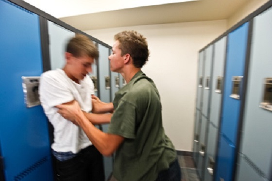
What you might not have seen coming was that around half of the report centered on in-school violence. To be sure, we’re told that there were only 407 violent events reported to the board during the 2022/2023 school year – which is a rate of around 17 events for every 10,000 students. 17:10,000 doesn’t exactly sound like an environment that’s spiraling out of control.
There was a caveat:
“Due to input errors by principals, the TDSB underreported the number of violent incidents that occurred between 2017/18 to 2021/22 to the Ministry by about 9%.”
Ok. But we’re still nowhere near Mad Max levels of violence. So what’s attracting so much of the auditor’s attention? Perhaps it’s got something to do with a couple of recent surveys whose results don’t quite match the board’s own records. Here’s how the audit describes the first of those:
“The 2022/23 TDSB Student and Parent Census was responded to by over 138,000 students, parents, guardians and caregivers. It showed that 23% of students in Grades 4 to 12 that responded to the survey said they were physically bullied (e.g., grabbed, shoved, punched, kicked, tripped, spat at), and about 71% stated they were verbally bullied (e.g., sworn at, threatened, insulted, teased, put down, called names, made fun of). Further, about 14% of student respondents indicated they had been cyberbullied. TDSB’s central tracking of all bullying incidents is much lower than this, suggesting that they are not centrally capturing a large number of bullying incidents that are occurring.”
“23% of students in Grades 4 to 12 that responded to the survey said they were physically bullied”. That’s not a great fit with that 17:10,000 ratio, even if you add the 9 percent of underreported incidents. And bear in mind that these students and their families were willing to discuss their experiences in a survey run by the school board itself, so it’s not like they’re hard to find.
But that’s not the worst of it. The Elementary Teachers’ Federation of Ontario (ETFO) ran their own survey in 2023. They wanted to hear about their members’ experiences with workplace violence. Here, quoting from the audit report, is what TDSB respondents told them:
- 42% had experienced physical force against themselves in 2022/23;
- 18% had experienced more than 10 of these physical force incidents in 2022/23;
- 81% indicated the number of violent incidents increased since they started working;
- about 77% responded that violence was a growing problem at their school;
- about 29% indicated they had suffered a physical injury;
- 57% had suffered a psychological injury/illness (such as mental stress, psychological or emotional harm) as a result of workplace violence against them; and
- about 85% indicated that violence at their school made teaching and working with students more difficult.
29 percent of teachers suffered a physical injury due to workplace violence. That’s elementary school teachers we’re talking about.
For perspective, even accounting for the 9 percent underreporting, the TDSB was aware of events impacting less than a quarter of a percentage point of their students (and apparently didn’t report any violence against teachers). But by their own accounts, 23 percent of all students and 42 percent of elementary teachers have suffered attacks. Are board officials willfully ignoring this stuff?
And if only there was some way to address violence and other criminal activities on school property. Perhaps – and I’m just spitballing here – there could even be people working in schools whose job it would be to (what’s the word I’m looking for?) police crime.
On a completely unrelated note, back in November, 2017, the Toronto District School Board voted 18-3 to permanently end their School Resource Officer (SRO) program. Since then, police officers have been unwelcome on board property.
To be sure, the TDSB has “accepted” all 18 of the report’s recommendations. But talk is cheap. Who’s to say that commitment won’t play out the same way we’ve seen with their fire drill compliance.
Can you spell “class action lawsuit”?
Power Struggle: Electric vehicles and reality

Elon Musk slams Trump’s ‘Big Beautiful Bill,’ calls for new political party

Canada Caves: Carney ditches digital services tax after criticism from Trump

Alberta judge sides with LGBT activists, allows ‘gender transitions’ for kids to continue
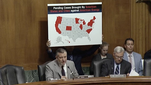
China undermining American energy independence, report says
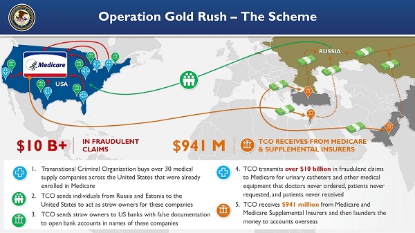
National Health Care Fraud Takedown Results in 324 Defendants Charged in Connection with Over $14.6 Billion in Alleged Fraud

Trump on Canada tariff deadline: ‘We can do whatever we want’
-
 armed forces1 day ago
Canada’s Military Can’t Be Fixed With Cash Alone
-
 Alberta1 day ago
COVID mandates protester in Canada released on bail after over 2 years in jail
-
 International1 day ago
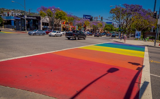
Trump transportation secretary tells governors to remove ‘rainbow crosswalks’
-
 Business1 day ago
Canada’s loyalty to globalism is bleeding our economy dry
-
 Alberta1 day ago
Alberta Next: Alberta Pension Plan
-
 Business1 day ago
Carney’s spending makes Trudeau look like a cheapskate
-
 Crime2 days ago
Project Sleeping Giant: Inside the Chinese Mercantile Machine Linking Beijing’s Underground Banks and the Sinaloa Cartel
-
 C2C Journal23 hours ago
Canada Desperately Needs a Baby Bump